 Viking
 kindly sent us a review copy along with the
two books to give away. We have been carefully poring over this new illustrated edition of Jane Eyre and these are our impressions.
Outwardly, the book is a paperback with a classic-looking spine made to look like leather. This contrasts sharply with the modern, colourful and powerful illustration on the cover. They are contrasting but oddly fitting too - this would be a proper description of this new edition in a few words.
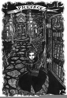
The book includes the facsimile page of the first edition and the inscription to Thackeray as well as the different prefaces to the second and third editions of the book. This preface shows the first full-page illustration in black and white. In a very gothic atmosphere, a large-eyed Jane opens the door and beckons us in.
The book is divided into the three original volumes and the chapter numbers start anew in each of them, something modern editions rarely do anymore. At the end there is a brief biography of both Charlotte Brontë and Dame Darcy.
Dame Darcy's illustrations are one of a kind. They might look too modern to some people. They aren't certainly the typical woodcut illustrations we would be used to. Dame Darcy's take on Jane Eyre is as fresh and as new as Jane Eyre itself was when it was first published.
Despite the modern feel to them, we would feel very confident stating that these illustrations are among the most loyal and truthful not only to the spirit of the novel but also to the letter. A seemingly impossible balance between the two has been found and makes complete sense. Jane has dark hair, large green eyes and is petite. For the first time in many years, Blanche Ingram is a brunette as she is in the book and Mr Rochester would be understandably not described as handsome. Mr Rochester's eyes have been charged with huge dark marks as a way of displaying his 'secret soul' and innermost worries. The precise atmosphere of the book has been incorporated into each and every illustration. Dame Darcy does not draw 'by ear' - she shows time and time again that she has immersed herself in the story and is not afraid to defy apocryphal reads in favour of the true story. She has opted for illustrating many of the lesser-known scenes in the book or those that are usually left out: the gypsy scene, Jane's dream of the wailing child, Aunt Reed's deathbed, Jane waking up at the Rivers'...
The book comprises two types of full-page illustrations: black and white ones on the regular paper and full-colour ones on bright paper where the use of colour is simply exquisite. These full-page illustrations are usually accompanied by some symbolic 'accessory' that renders them both less conventional and more meaningful. (You can see a few samples
here).The volume also features smaller but just as intense black and white drawings on the margins, corners... The scenes there depicted are not at all less interesting or relevant to the plot.
We are truly impressed with this book and would like to encourage one and all to
enter our competition to win a copy. If you don't get lucky then you should pick up the book at your favourite bookshop: money was never better spent than in a wonderful story so vividly and unforgettably illustrated.
Categories: Books, Jane_Eyre, Comics, Review


Interesting web-site and you get very Excellent important information about Hair Restoration Bruxelles
ReplyDelete